Cobabe Collection
Client
Cobabe Collection
Role
Creative Director, Art Direction, Account Management
Location
Salt Lake City, Utah
Type of Project
Rebrand, Design Strategy, Creative Direction
Cobabe Collection is a premier custom design and furniture fabrication company. The client gave a very specific vision for their brand. They wanted to capture what they stood for and that they were a historic and established company in the community.
This was a very creative-minded client being that their craft is art to them and to their customers. In every step of the process, we were able to get praise that they felt their brand was coming to life.

Stylescapes
One of the key steps of this process is the creation of stylescapes. A stylescape is a collection of images, textures and typography curated in order to communicate a look and feel. I like to call them, mood boards on steroids. This step alone sets the tone for the whole rebrand overhaul and propels the creative work in the right direction, while having input from the client.
At times, up to three separate stylescapes can be created. Three very different directions that all fall within the guidelines of the strategy research step. The goal is to have the client pick one of the 'doors' presented and then the team can 'walk through that door' and create the brand identity.


Logo Exploration
One of the first steps is to go into research mode. This is where we look into consumer data, personas, design challenges, competition/industry, brand voice and this case; we research names for the new company.
It was important to have this research done. Once this is presented to the client, we get final input and then start with the creative work. The strategy research steps become our 'Northstar' as we create anything.
Final Logo and Styleguide

Summary
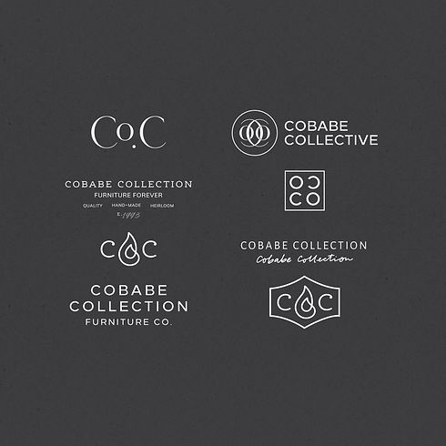
The process helped define our goals early on and mapped out the necessary areas of focus to be able to deliver the highest quality brand. The client was very involved, giving us feedback and opinions that were really helpful but they appreciated the time and effort being put in from our end. The Phoenix icon was a result of great research and collaboration. Their old shop had burned down in an accident and when that happened, our client told us of the story he told his wife. He had a vision of rebuilding and starting using the analogy of 'rising from the ashes'.
The client is currently in the works of getting their website designed with this new branding.